Film Noir
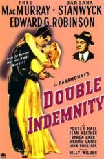
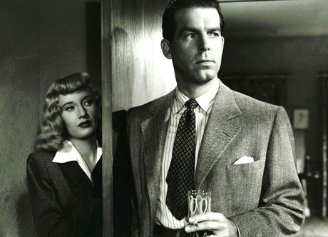
Double indemnity (example) film noir
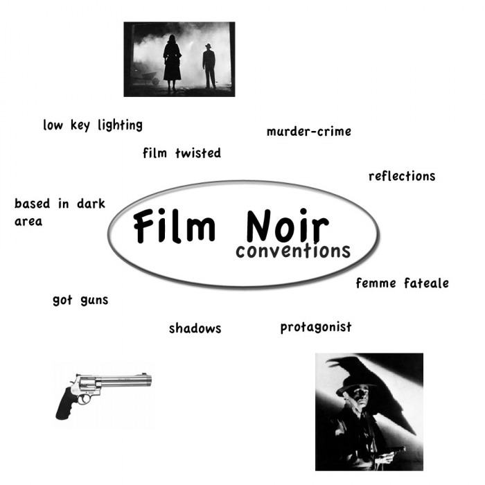
(Characters) what are they like?
Femme Fatale

Driven
Predatory
Promiscuous
Cold-unfeeling
Selfish
Deceitful
No moral
protagonist
Drinks/smokes
On the edge
Weak willed
Desperate
No moral
Easily seduced
Lives in the world of crime (often a pi policeman) Reflections
Dutch-Angle
Dutch Angle is often used to portray the psychological uneasiness of tnsion in what is being filmed
chiaroscuro lighting
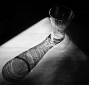
Chiaroscuro Means (Italian for light-dark) and it is a different contrast between light and dark
Film Noir Research
SunSet Blvd
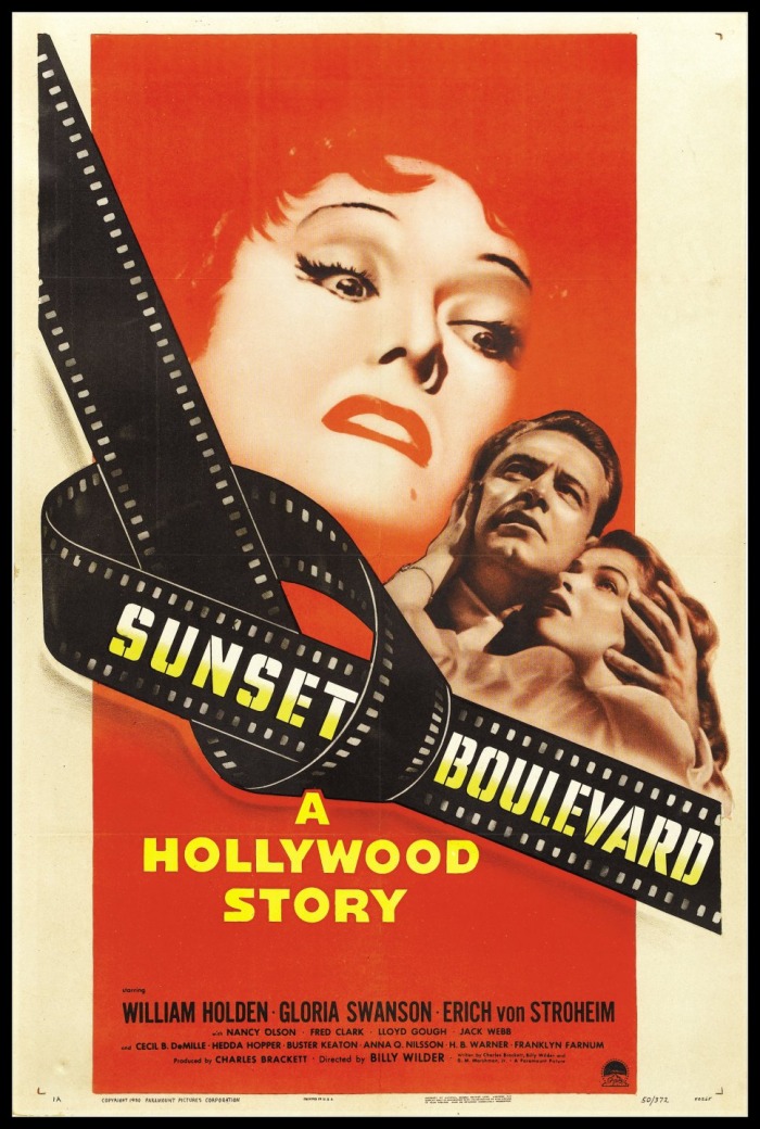
why i don't think this is a very good poster is because film noir is basically a film that is dark and this poster does not represent it in the correct manor. In one point is the red parts of the poster makes it a bit like film noir because it makes it like blood in my opinion.
M
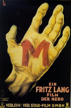
In this poster i thought this was o.k because of the background was black and on the hand it was red so i thought the "m" on his had was blood and the m must have a reason.
The Third Man
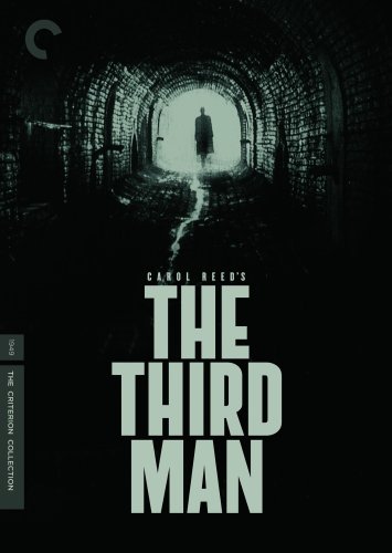
In this poster you could straight away tell that this film could be about horror or film noir because of the use of back and the use of lighting.As for all of the posters i chose i think this one was one of the best kind of film noir poster and the film and a very good story line.
Sin City
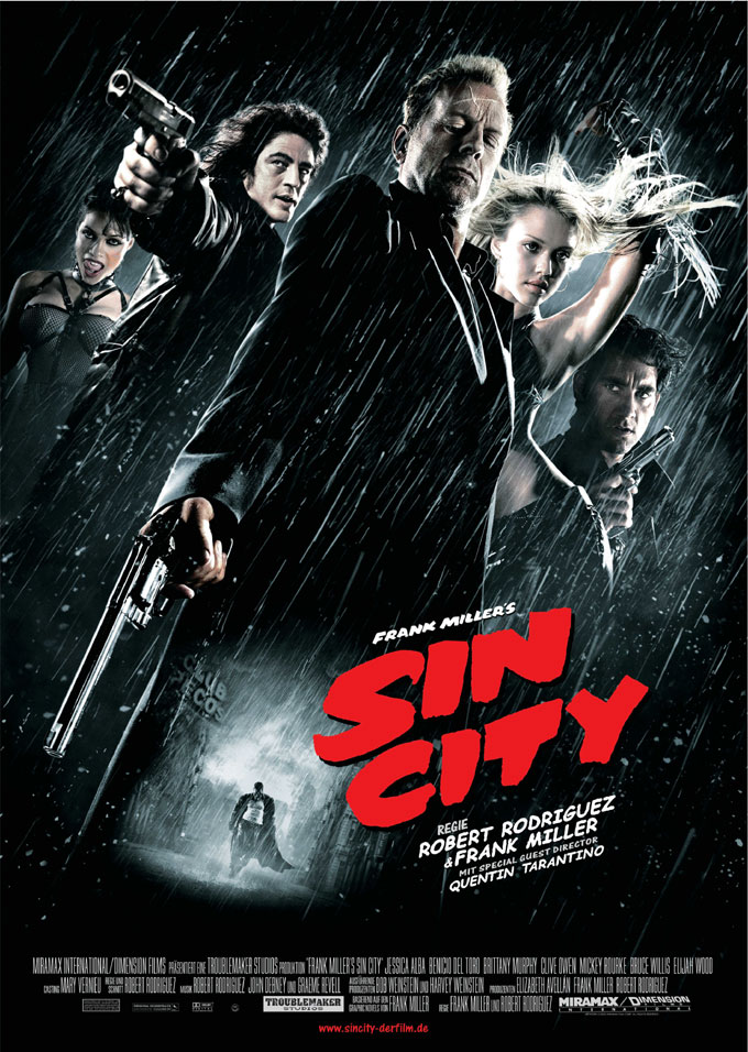
In this poster it has a great deal of colors. In the modern society this is how film noir posters will look like.In the film it has a great skim of black white and red because when some on is bleeding the blood stands out to be a white colour
